An ongoing design exploration focused on layout, hierarchy, and storytelling.
Context
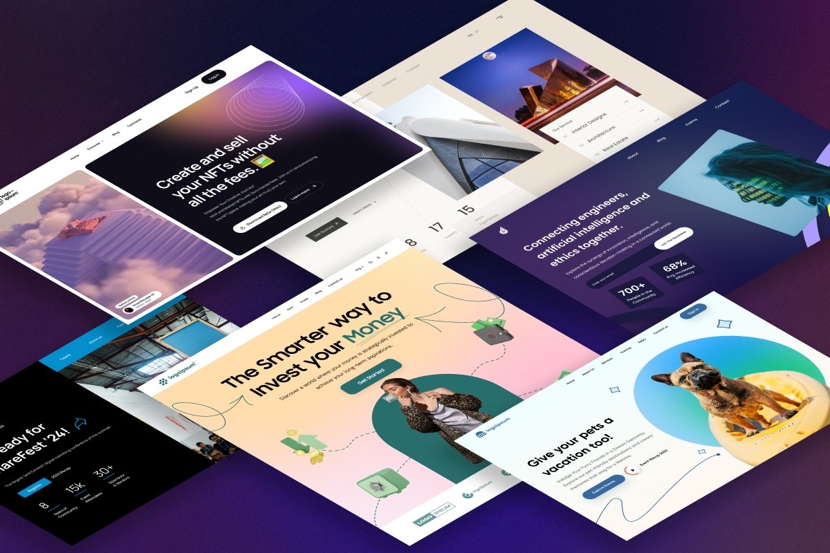
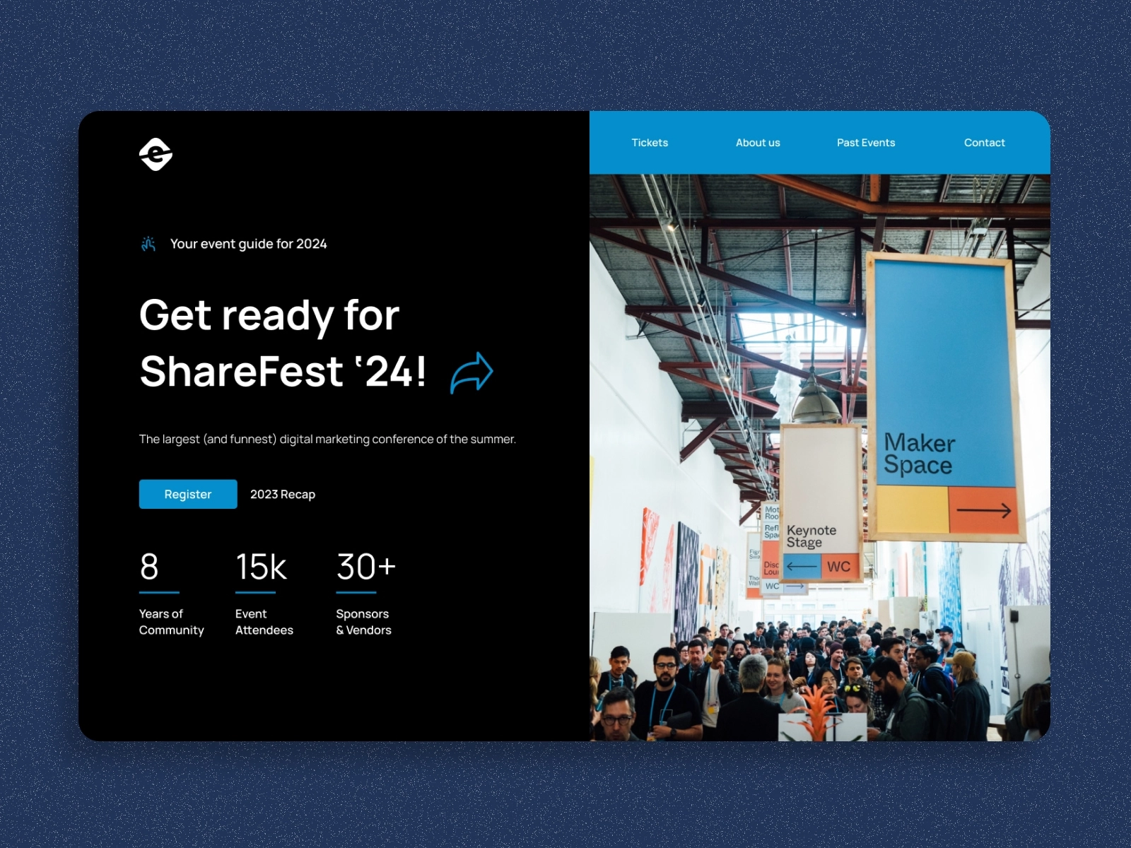
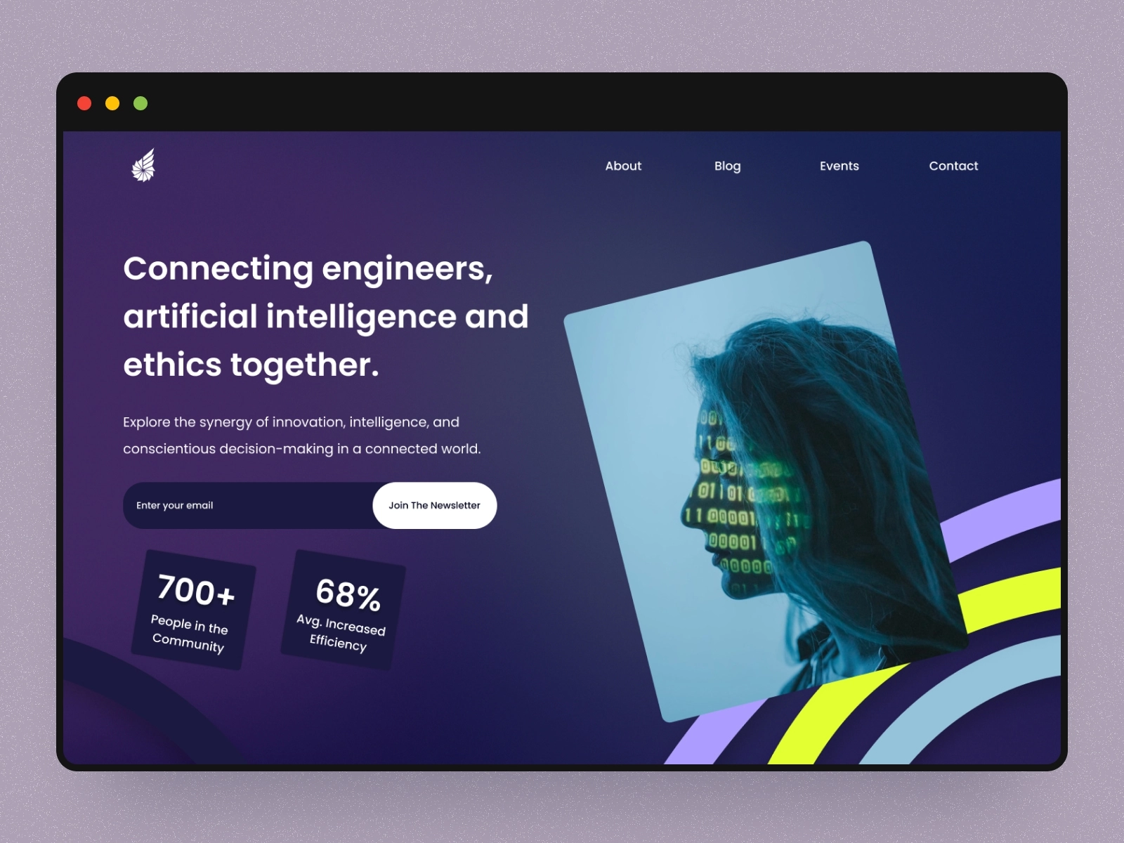
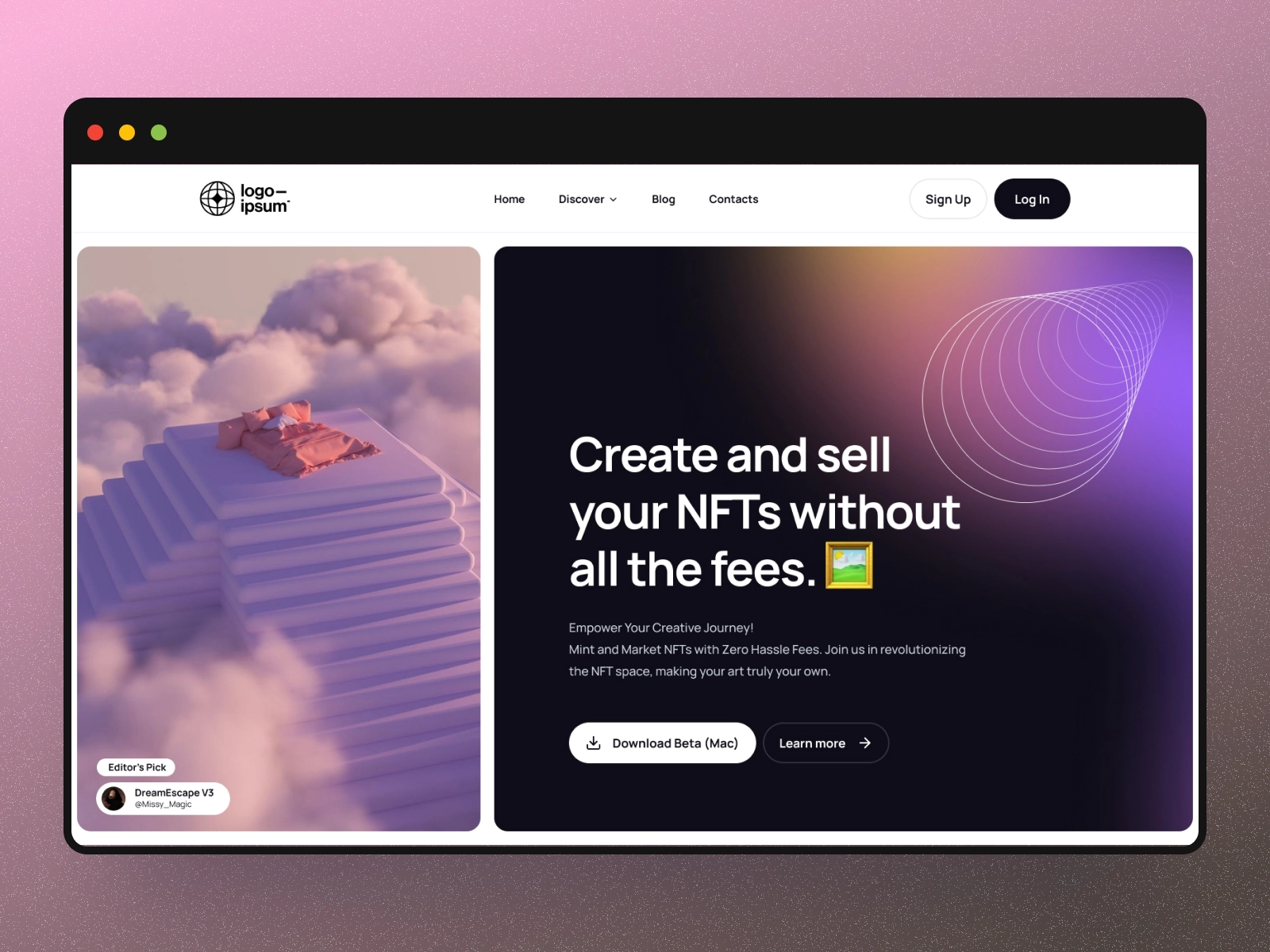
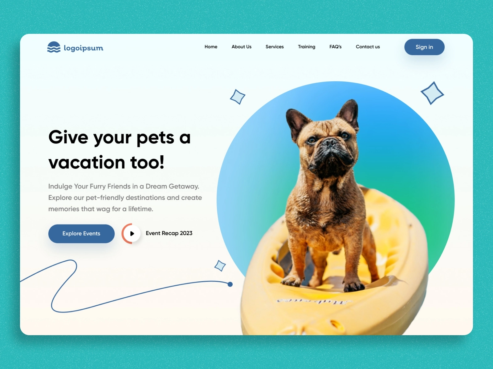
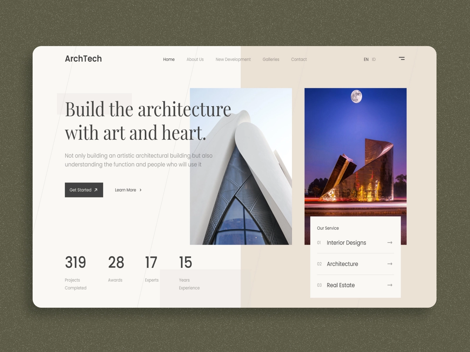
This study was a self-directed series created to strengthen my visual decision-making and creative agility. Each hero section focused on different industries and moods—experimenting with type systems, grid alignment, focal imagery, and motion concepts. The goal was simple: refine the first impression of any website through clarity, composition, and emotion.
Solution
The project became a modular framework for hero design principles:
Clear focal hierarchy to guide user attention.
Consistent visual rhythm between text, image, and whitespace.
Exploration of micro-animations and contrast to elevate storytelling.
This exercise sharpened my layout intuition, improved speed in Figma, and influenced how I now approach brand-first web design.